Showing posts with label graphic design. Show all posts

product packaging design agency mumbai Product packaging design requires more than a good eye, especially food products.

Graphic designers who design packaging have to focus on creating a strong brand through effective design.

But what makes a good or an effective packaging design for F&B?


Packaging keeps the product safe, but another important function of packaging is to convey information to the buyer and the user about the contents within. An experienced packaging design agency understands that a simple and clear packaging design should be able to achieve that within first few seconds.

In other words, when a customer picks up this packaged product, she should immediately be able to tell what the food product is, its type and of course what brand it is.


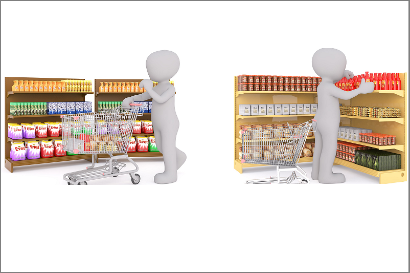
Next time when you go shopping in a supermarket, notice how you look at products placed on the shelf. You might find yourself just glancing at them, not in detail and never in isolation. And then a distinctive and relatively more appealing packaging design catches your attention. That’s when you generally decide to take a closer look at the product.
packaging design agency mumbai

A successful packaging design is not necessarily the most good looking one. It should be able to stand out from the clutter.

Related ArticlePackaging Tips for Successful Branding

A beautiful design doesn’t always guarantee that. But a research of your competitor’s product packaging design does help.


When you get a client brief for food packaging design or say wine label design, ask them how they want their product to be seen by the shoppers. Do they want to slot their product as a price driven value brand or a premium brand?

As a graphic designer working on consumer product packaging design, you must find out how your client wants the F&B brand to come across and target what kind of buyer segment. You will be able to choose a more appropriate tone and use subtle details to appeal to that category of buyers though your design.

Related Blogs on Packaging Design


Read more »

brochure designer in mumbaiIn the digital age, the definition of marketing collateral has evolved to include digital assets like website, eBooks, etc.

Most likely you already knew that :) What you want to know is whether brochures are still relevant. Do people still interact with a printed brochure in the age of new media? Is it worth investing in them?

Don’t be surprised if I say marketing brochures are still an important part of the marketing mix. Big or small, enterprise or start-up, B2B or B2C, organisations use brochures for communicating with customers at different touch points.

Image for post
Take a look at the ways to make use of marketing brochures or the types of marketing brochures.

Here are four reasons why brochures are still considered an important marketing collateral to showcase the brand and its offerings.


1. A Break from the Digital Monotony

What was new and novel has turned into a pile of clutter. We skim through countless emails and articles every day. Mechanically move from one to the next. Printed marketing brochures offer a break from this digital monotony. It offers an alternative medium to connect with your audience.

Also, imagine reaching out to CXO audience through email. Well most probably you won’t pass through their assistant’s sight. A physical copy of a printed brochure occupies real estate on the CXO’s desk.


2. Tangible Impression

Well designed and appealing print collateral still has the power to make a tangible impression. It hits you straight. It literally adds weight to your brand’s presence. And that experience is derived from the intersection of a nice design, content and the quality or print and paper. Creative brochure designers skilled in brand design use content and design in harmony with the overall brand guidelines. That helps in strengthening the brand image.


3. A way to Drive Traffic to Digital Channels

Printed brochures offer a way to drive traffic to digital channels. To maximize the impact of your marketing plan, think beyond the single dimension approach and integrate digital and print. Whether it is our product catalog communicating with your customers post purchase, or an exhibition giveaway brochure targeting prospects in pre-purchase stage, every type of brochure can be designed to drive traffic to your organisation’s digital channel. The trick is to integrate it properly within the content of the brochure.


4. Tap Physical Customer Presence


Finally, no matter how much time your target audience spends online, they still exist in the physical world. They still go to retail store or attend events. They still visit their doctor’s clinic and they still spend considerable amount of time offline. What better way to tap their physical presence with an impressive printed brochure.

Digital age has given a new power to printed marketing collateral to re-engage the target audience. The key lies in giving a clear purpose to the brochures and integrating them wisely in the overall integrated marketing plan.

You might also be interested in: Creative real estate brochure designs

Read more »

Corporate brochure is an important company marketing collateral for every business. It gives a voice to the company. It communicates the brand values, highlights the brand strengths and creates the desired brand image which is made up of facts, vision and feelings. When used strategically, a corporate brochure can serve as an excellent tool for corporate storytelling.

Increasingly, marketers are deciding to make company brochures more engaging. They are embracing a different style of corporate brochure design to take it to the next level.

What is it that marketers are doing differently?

Well, they are indulging in presenting the company information in a highly visually engaging way. Marketers are opting for coffee table book inspired corporate brochures to present their brand in a memorable way.


Corporate Brochures Inspired by Coffee Table Book Format


Coffee table book format is larger and lavishly illustrated. They are like high-end art books and designed to offer visual treats to its readers.

Leading Indian coffee table book design company OH! Design Studio believes that presenting a company brochure in the form of a coffee table book is a wonderful way to create a powerful visual impact on the readers and stakeholders of the company.

Here are some such corporate brochure projects shared by one of the top corporate brochure design companies in India — OH! Design Studio. OH! Design, a Mumbai-based integrated branding and digital marketing agency, specializes in designing compelling, inspiring and state-of-the-art coffee table books. 


1. Portfolio of a leading Indian architectural & interior design firm


ZZ Architects use this brochure as a coffee table book to engage their clientele in the reception area or meeting rooms ,while the latter is patiently waiting for their host to join them.

The brochure has a grand and exclusive feel to it. At the same time, the graphics are modern and clean. Together these elements communicate and highlight the brand promise of the client’s firm and do justice to the presentation of their bespoke and contemporary projects.


2. Corporate brochure for the largest valve manufacturers in India


Using the coffee table book format, OH! Design Studio designed this company brochure to express the legacy of an iconic company. By using stories, imagery and design, OH! presented a visually engaging journey of this company through time.

For more information, connect with OH! Design Studio at letstalk@ohdesignstudio.com

Other links that might interest you:

A unique corporate brochure design for a financial services firm

How Coffee Table Books are used for sparking conversations in marketing.

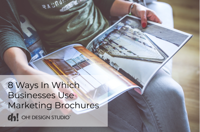
8 Ways in which businesses use marketing brochures

Read more »


OH! Design Studio recently designed the brand identity of Al Kiera — an upcoming child development and learning school in India.

Not all children of school age develop at the same pace. Some growth barriers develop into more serious problems that continue into the later stage. The de-evolution of their confidence forces such kids to stay grounded. Al Kiera provides the required training for personality development of such kids.

OH! Design was appointed to design the logo for this child personality development school. They created a simple logo representing wings provided by Al Kiera that helps kids rise above their growth barriers and soar high with confidence.

Image for post

Follow OH! Design Studio on Twitter to get updates on the latest work by the brand studio.

Read more »


I’ve observed a lot of graphic designers focusing only on making their designs beautiful. Often they forget that every design has a purpose and that is to communicate a message or some information to its target audience effectively.

Different Strokes For Different Folks

I’m not saying that the designs should not be attractive. Of course the logo design, brochure design or packaging needs to look attractive, but ‘attractive design’ is relative.

What graphic art attracts a sophisticated luxury product buyer could look too drab and dull to a flashy teenager. And what instantly catches eyeballs from rural buyer would in all probability be an instant-miss by this chic urban customer. The point is, design keeping in mind the target audience.

Inconsistent brands confuse buyers

Graphic designing is an element of branding. A customer experiences brand through the product or service, that brand’s values, personality and communication among other things. So all forms of visual communication including illustrations, packaging design, point-of-sale, website design, logo design, marketing collateral etc help create a brand identity in the target buyer’s mind. Communicate the brand consistently and clearly at every touch point. It should feel like it derives from one place.

Great design is invisible so that the brand message can shine through

I’ve seen graphic designers over complicate designs to convey marketing messages. The design challenge is to simplify the brand message visually in such a way that the design resonates subconsciously with the audience telling people how they’re supposed to interact with the brand. Highlight the brand and its message, not the design. “Design should never say, ‘Look at me.’ It should always say, ‘Look at this.’” – David Craib

Published by OH! Design Studio – a branding and integrated graphic design firm based in Mumbai, India. From brand strategy to brand activation on online and offline channels, OH! Design Studio provides 360 degree creative services for launching new brands, re-branding and online brand activation & marketing.
Read more »

Coffee Table Books are exclusive and visually impactful books with captivating images and text. Such books are a wonderful way for readers to enjoy great works of art and photography in their home, but that s not their only purpose. The most common use of coffee table books is to use it as an accent piece to enhance the interiors or to entertain guests patiently waiting for their host to emerge from some other room.
Here's an example of a coffee table book on ethnic art and customs in India, designed for people interested in Indian Legacy.
coffee table book designers mumbai
Folk Yatra - Coffee Table Book

While some buy coffee table books purely for display, some buy it to make a personal statement about themselves. These books occupy the prime real estate of the table tops instead of dusty book shelves. By leaving a book out on the table for all to see, they're putting themselves out there. It's like saying -This is what I like, and This is what I know.


So How Can Brands Use Coffee Table Books for Marketing?


Through the medium of coffee table book, brands can tell their story. At OH! Design Studio, coffee table book designers worked on similar project.  The client's company was reaching milestone date. They wanted to reflect on their success.
We designed a coffee table book for them to showcase the history of their brand chronologically, highlighting the products, people and environments that have shaped their evolution.


Coffee Table Book Designs By OH! Design Studio


coffee table book
Taj Hotels - Coffee Table Book
    
coffee table book designers in India
Sakhi - Coffee Table Book

best coffee table book
Chrysalis- Exim Bank Coffee Table Book

Read more »

brochure designer in mumbai

Great photography makes a brochure designer’s job easier. But real estate brochures are typically designed by developers and used by realtors much before the property development even starts. The real challenge for brochure designer is to bring the visual appeal to the real estate marketing collateral in the absence of actual shoot.
 
At OH! Design Studio, we have worked on many real estate projects. Our designers have created compelling brand communication designs for brochures, outdoor publicity campaigns, newspaper ads, etc. The one that has grabbed the attention of many designers and people on Pinterest is of 9 Almeida- A luxurious residential tower in upscale Western Suburbs of Mumbai, India. The design concept was – ‘9 reasons to move to Bandra’
 

Read more »

If you’re planning to revamp your website, then hunting for the right website design agency would be your next step. But what are your evaluation criteria? Is it the visual design skills or the coding capabilities of the web design firm? Common mistake many site owners make is they usually don’t care about the design approach of the web design firms they are evaluating. 
 

Why UI Designer’s Approach Matters?


If a web designer starts his pitch with web design template options

OR

If you have an urge to call for home page sample design to evaluate the skills of the UI designer, then stop there!

Clearly in both instances, focus is only on the look and feel. What about the site navigation & deciding what information goes where? A good looking website doesn’t necessarily does a good job of converting site visitors into leads. A beautiful design doesn’t ensure your marketing messages resonate subconsciously with the audience telling people how they’re supposed to interact with the brand.

At OH! Design Studio, we strongly believe that UI design does not start with graphic design, but with content strategy. After all, content is the main reason why people visit your website. Content-First design is a much better UI design approach than starting with web page layouts in Photoshop. 


What is Content-First UI Design?


In a nutshell, when UI design starts with content requirement for the website and design comes at the end that is content-first design-last approach.

In this approach, website content is identified on the basis of marketing goals, lead generation and SEO goals and the information requirement of the website’s target audience. That forms the basis of website navigation and the way information is structured on the site. Look and feel design comes at the end.

Website design is an important part of development and is not limited to page template designs. Any UI designer can design a website. But hiring a good UI designer who takes a logical approach towards designing can make all the difference to your online marketing communication. 


Published by OH! Design Studio. From brand strategy to brand activation on online and offline channels, OH! Design Studio provides 360 degree creative services for launching new brands, re-branding and online promotion.To visit our website, click here.
Read more »

brand and communication design

Brand design and communication design has to do more than just look good. 

Design is not just what it looks like and feels like. Design is how it works” – Steve Jobs. 

So what makes great design for brand communication?


Great design is invisible so that the brand message can shine through


I’ve seen graphic designers over complicate designs to convey marketing messages. The design challenge is to simplify the brand message visually in such a way that the design resonates subconsciously with the audience telling people how they’re supposed to interact with the brand. Highlight the brand and its message, not the design. "Design should never say, 'Look at me.' It should always say, 'Look at this.'" – David Craib.


Brand communication design should feel like it derives from one place


Graphic designing is an element of branding. A customer experiences brand through the product or service, that brand’s values, personality and communication among other things. So all forms of visual communication including illustrations, packaging design, point-of-sale, website design, logo design, marketing collateral etc help create a brand identity in the target buyer’s mind. Communicate the brand consistently and clearly at every touch point. It should feel like it derives from one place.


Successful design connects a brand with its target audience 


What graphic art attracts a sophisticated luxury product buyer could look too drab and dull to a flashy teenager. And what instantly catches eyeballs from rural buyer would in all probability be an instant-miss by this chic urban customer. The point is, design keeping in mind the target audience.

The original version of this post was released on Graphic Designer's Blog.


Published by OH! Design Studio - a niche branding agency based in Mumbai, India. From brand strategy to brand activation on online and offline channels, OH! Design Studio provides 360 degree creative services for launching new brands, re-branding and online promotion.
Read more »

Before this dairy brand tasked OH! Design Studio to redesign packaging of their entire range of products, they had already made an attempt. 

They got a limited category product packaging redesigned through some other packaging design company in India. But they wanted more personality and identity than what they got from their previous attempt.

OH! Design Studio, packaging design company in Mumbai, helped reinvigorate the brand by giving its packaging the desired personality and a strong recall value. 


New designs by OH! Design Stusio


Read this before- after comparison of the product packaging design for this dairy brand.

Read more »


OH! Design Studio has an impressive portfolio of high-end real estate brochure design, especially for luxury segment. The design firm manages brochure designing from concept, design,copy to print.


At OH! Design Studio, we have worked on many real estate projects for branding, communication design and online marketing. When it comes to brochure designing, especially for luxury properties, paper choice and printing effects are an important part of successful brochure design. That’s why we insist on end-to-end execution for brochures and everything that we design for print.


1. Luxury Real Estate Brochure and Identity Design

Increasing brand awareness and building brand recall for this real estate client was the primary objective of creating this luxury real estate brochure design. Located in one of the prime areas of Mumbai Western Suburbs, we were given the task of presenting this single tower as a luxurious upscale entity.


Brochure Design Concept: Life 360 degree.

Brochure Cover Design


Brochure Custom Page Designs


2. Tri-fold brochure design


3. Brochure design for luxury villas


View a collection of OH! Design Studio's real estate marketing and communication design portfolio below:


Looking for a brochure design company or graphic design agency? Contact OH! Design Studio at letstalk@ohdesignstudio.com.

Read more »

package designing tips for success branding

Branding and packaging design agency OH! Design Studio highlight three strategic packaging tips for successful product branding.

It is very difficult to separate consumer’s perception of the brand from its product packaging. That makes product packaging design an integral part of overall branding efforts.

Packaging designers have an understanding of creative and visual challenges, but they need strategic inputs from brand managers to be able to create a design that sells the product. 


Here are the three things you must tell your packaging design agency for successful product branding.

Target Market and Positioning


packaging designers

  • Every company wants to sell their products to largest number of consumers, but your constraint is that marketing budgets are not infinite. So better to determine which consumer base would be most receptive to your product and let your branding agency devise packaging design to attract that target consumer group most effectively.
  • Brand Positioning gives a compelling picture of how the marketer wants the target market to view the brand. Since packaging design has a huge impact on the brand image, hence positioning statement must be provided to the packaging design team as a reference.
As mentioned before, brand image perceived by consumers is highly influenced by packaging design. Every designing decision that is made should be judged by how well it supports the positioning statement.

Is your skincare product made up of safe ingredients ? White, the color of sterility, would be a great color to incorporate in your packaging design.
Are you selling a funky cosmetic brand? An enthusiastic use of bright and exciting colors would be a great way to let the packaging design pop.
If your audience values organic skincare product, then earthy tones could give the desired tone to your packaging.
Brands use packaging as a way to effectively communicate their unique value proposition to their target customers.
Related Article: What is target audience?


Product Category


branding and packaging agency
Packaging design by OH! Design Studio for OTC pharmaceutical product in pain relief category
  • Tell your packaging design agency exactly what category does your product belong to and who the competitors are. 
Purchase decisions are mostly made at the point of sale. The packaging has to stand out from its competition and communicate effectively with the buyer.

Successful packaging design is not necessarily the most good looking one. It should be able to stand out from the clutter. A beautiful design doesn’t always guarantee that, but a research of your competitors’ packaging does help.
  • Also, knowing product category gives an idea about the decision shoppers make for example do they go for brands in that category or color or whether they are driven by some condition. 


Packaging Design Architecture


  • You don’t want products of your brand competing with each other when looking at shelf space. With a large brand portfolio, brand architecture should be coherent across the range to create connectivity across segments and categories. There are many ways to get it right like standard use of your brand’s logotype, or creating guidelines on how the brand logo and sub-brand logo would appear.

  • For new brands with no history in marketplace, packaging and branding guidelines can be prepared before establishing a new product’s image in the eyes of consumer. For exiting brands, visual elects are already a part of it’s brand equity and hence any change in brand design must be handled with care.

If this sounds relevant to you, letstalk@ohdesignstudio.com for branding and packaging design services. OH! Design Studio is a branding firm in Mumbai, India.


Read more »

At OH! Design Studio, we love creating packaging designs. 

As a branding and integrated design firm, we believe that packaging design is a crucial purchase experience touch point for brands. 

Be it a packaged product for retail shelves or the take-away food packaging for restaurants, for every single packaging design project which we have worked on, our design objective has always been to reassure the potential consumer that their purchase will deliver the value they're expecting.

Let's take a look at some of our creative packaging designing projects.


Dairy Brand Packaging


PUNJAB SIND

Recently we redesigned packaging of the entire product range of Punjab Sind – a popular Mumbai based dairy brand. We took a deviation from the usual imagery on dairy product packaging and crafted a fluid design against clean white background.
 
packaging for dairy products


Wine Label Design


MOKSHH WINES

Exclusivity was the keyword when we designed the Living Liquids wine collection. Intricately conceived visuals gave a definitive voice to the brand- a voice of elegance and luxury.

wine bottle packaging and label design


Take – Away Food Packaging


CAFE AMRICANO


While working on take away food packaging designs for Cafe Americano, we took up the quintessential American stars and stripes with fonts reflecting the young, vibrant nature of the cafe.

food and beverage packaging design

MANGIAMO

creative salad and pizza food packaging design


Pharmaceutical Product Packaging Design


packaging design company in mumbai

Looking for product packaging companies in India? OH! Design Studio can help. Drop us a line at letstalk@ohdesignstudio.com or call at +919820854943

Read more »